Making Uber Reservation Always Reachable
Making a reservation on Uber is the most critical feature, and I redesigned it to control in one hand

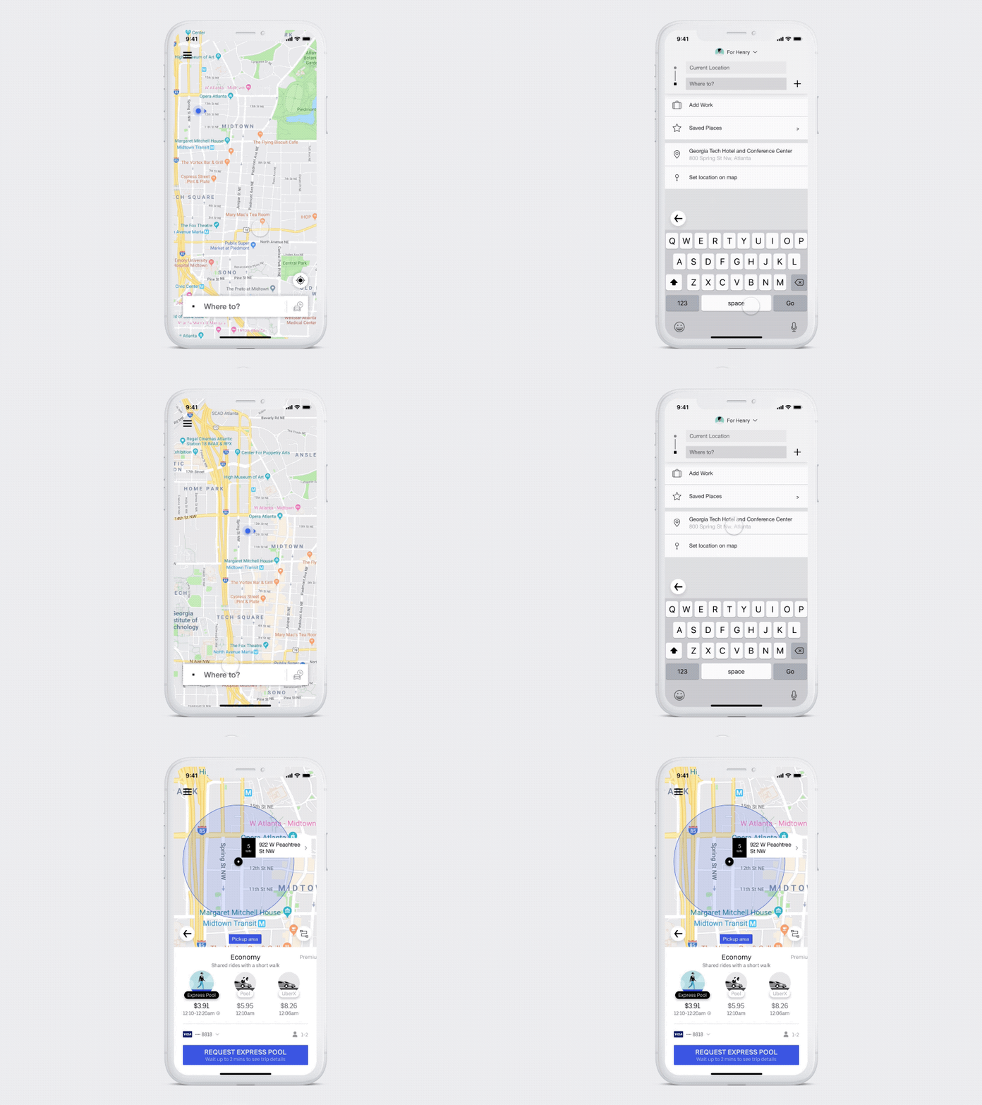
Finished redesign of Uber app


Overview
For a design challenge, I chose to focus on Uber’s reservation feature. Uber is one of my most used apps whenever I travel. After Uber’s 2018 redesign, the app and brand are more sophisticated and unique. However, some buttons are still hard to reach within one hand. In addition, I wanted to be considerate about which hand a user is holding with.

Hard-to reach UI elements on Uber app

Goal
My ideal goal for this challenge was simple: make the reservation process performable using only one hand.

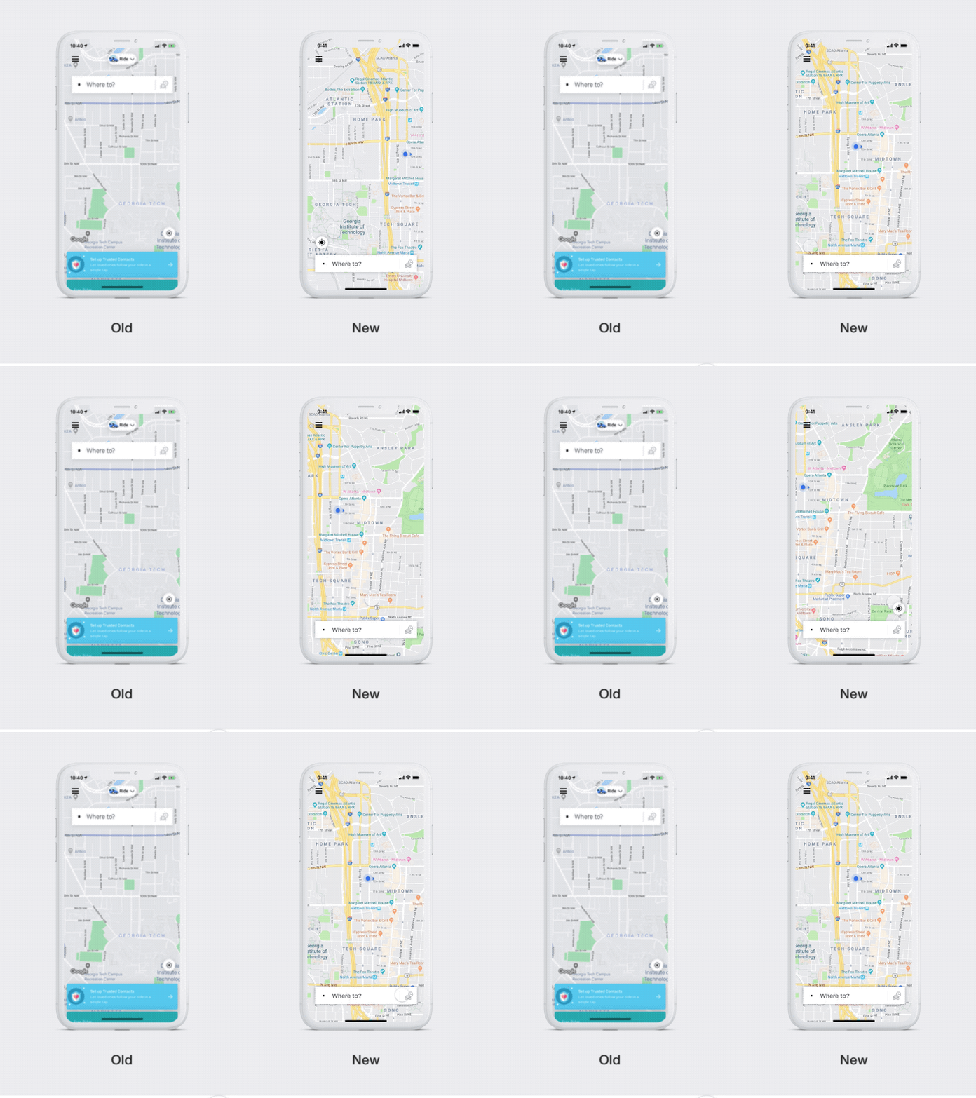
Left: Search Bar on the top / Right: Search Bar on the bottom

Change 1: Search Bar Location
To make a reservation, this search bar is the starting point to input destination. However, since it’s on the top, users have to use the second hand to reach. By moving it to the bottom, everyone will be able to access the feature instantly.

A location button shows depends on the finger position

Change 2: Location Button
When I used the newly designed Uber app, I loved how the location button didn’t show until it was necessary. I wanted to make it better. Detecting a user’s finger position, the button automatically positioned on either left or right side for both left and right hands.


Re-located Back Button

Change 3: Back Buttons
There are many situations I had to go back to a previous screen to refresh price or input different address. Reaching a back button on a current design with one hand is not easy. I chose to create a floating back button so it’s more approachable.

Stretch Goal
For this design challenge, I sorely focused on reservation reachability. In addition, I want to focus on how I can move menu items to increase the reachability and re-organize UI elements where back buttons were.