Two Ways to Improve Apple Home App
How Apple can improve the current Home app design based on usability testing

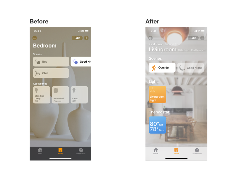
Finished redesign of Apple Home app

Overview
Apple’s HomeKit is a home automation platform built to connect diverse accessories to Apple devices and control using these and Siri. While it is competing with Google Home and Amazon Echo, I enjoyed using this more because of its integration into the operating system.
While I was testing different smart home solutions, I read Mac Stories’ article about the Apple’s Home App limitations. This inspired me to think how Apple can improve the app, and I chose to focus on how it organizes the accessories and layouts to see the information faster.
To validate usability problems, I chose to conduct a case study to enhance Home app for iPhone experience.

Project Summary

Goals
My goals for this project were to:
1. Utilize UX research methods to uncover user problems
2. Generate solutions based on the feedback
3. Prototype and test solutions with users to enhance the Apple Home experience

To perform the usability test within my limited time and budget, I asked Georgia Tech students as participants

Research: Usability test
I chose to conduct a usability test because of my limited time and budget.
I asked five Georgia Tech students on the campus to complete specific tasks to test the core functions of the Home app.
Here are examples of how I prompted someone to complete tasks:
“You just got home and wanted to turn on the bedroom light. Show me how you can do the task.”
“You want to check the accessory status in a kitchen. Browse to the kitchen tab and turn off the kitchen light.”
Using these questions, I wanted participants get just enough clues and be able to explore the prototype to observe their behavior.
Thankfully, every participant I talked with was very cooperative, and while I was very nervous to speak to a stranger, I was able to observe real problems.

Usability Findings
While everyone was able to complete the tasks, I was able to observe a few usability issues based on their behavior and feedback.

Pain Point 1: Accessory buttons are overwhelming
While everyone was able to find a button quite quickly to trigger a specific light to be on, four users expressed their first impression as “overwhelming.”
This issue was originally pointed at MacStories’ article, and this result showed users may spend longer time finding a right button.


Solution
My solution utilizes a familiar floor plan design to re-organize accessory buttons on a Home tab.
I chose this design because participants mentioned a few times that using a floor plan would be easier for them to navigate and find an accessory buttons than a grid format.

Created floor plan design to understand where accessories are located instantly


Pain Point 2 and 3: Navigating the Rooms Tab
For this task, I realized when users face an obstacle, they naturally touch and drag the screen to discover anything new. There are two ways to navigate between rooms in the Home app, and while only one person used a specific room button, others found a swipe gesture accidentally as they tried to figure out how they could navigate.
The current design does not give any hint on how users can browse, and even when they figured out the swipe, they still didn’t know the next page until they swiped.
Many of them didn’t see the rooms button on the top because it was small.


Solution
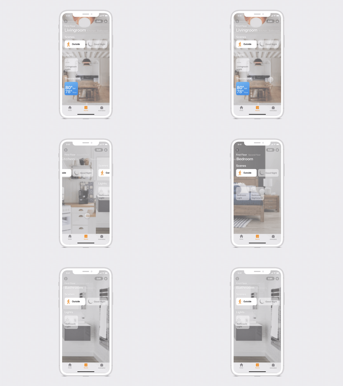
I wanted to focus the swipe usability issue because I really enjoy swiping between rooms. I chose to indicate inactive room list on the top to hint users that they can tap and swipe to access the next room.
In addition, users can browse multiple floors within seconds instead of endless swiping.


By showing other rooms on the top menu, participants were able to tap to move around, then learned the swipe gesture naturally


Solution Summary
At the end, I was able to solve the observed problems successfully with my design iteration. Using a floor plan design, participants were able to recognize each room and associated accessories. In Rooms, by hinting rooms structure on the top, they were able to navigate through either tapping or swiping. In addition, even if they didn’t know the swipe gesture, the tapping interaction will move the page dynamically so they learned the feature naturally.
For a stretch goal, I would want to focus on how HomeKit accessories are added to the app.
