


Redesigning a car-sharing app to improve the reachability and usability.
Final redesign of ReachNow
ReachNow is a car-sharing service run by BMW in a few selected cities in the U.S. When I lived in Portland, I got a chance to use the service, and after experiencing a few frustrations while interacting with the app, I chose to create my own version.
How the redesigned app works at glance
After finding a few participants who had used ReachNow before, I measured how long it took them to unlock the vehicle on both old and my version of the app. While my app was a prototype, I observed a few didn't realize the vehicle was unlocked which prompted them to wait longer. With my redesign, they saved up to 30 seconds on the unlocking process and everyone who tested felt it was smooth. They appreciated the car inspection section before the clear unlock message. They also navigated the app quicker than the old version because of the improved reachability.
For this project, I focused on:
1. Reorganizing the layout to move main controls to the bottom for reachability.
2. Streamlining the reserve process to declutter the screen.
3. Emphasizing the report functionality during an unlock process
Early brainstorming stage
As I started low-fidelity prototyping, I went over each screen to determine which element to keep. In addition, I worked very heard to re-construct the reserve feature to the bottom for reachability.
For medium fidelity prototyping, I recreated the current UI and started exploring and expanding my ideas
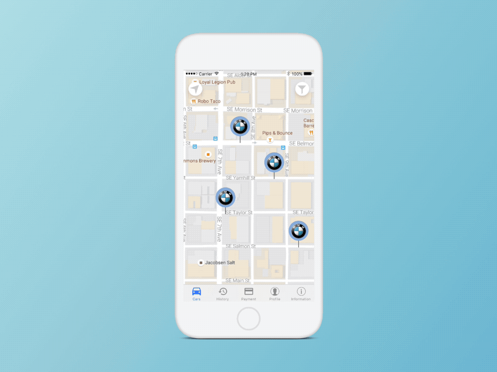
During the mid-fidelity prototyping, I found five ReachNow customers on Twitter, and asked a few questions as a survey. Surprisingly, all five never used the Lise feature when they made the reservation. Therefore, I chose to focus on the map view and enlarged the map screen.
First, I moved the hamburger menu to the bottom for reachability. By doing this way, interactors understand main menu options and be able to touch easily with their thumbs.
The second is re-organized buttons. I changed how the filter functions so they can choose more than one brand for customization.
I had to move location and filter buttons to the top because of this reservation process. In an original design, the reservation layout was on the top of the screen so it was not easy to reach. By moving it to the bottom, the reserve process is easily reachable using thumbs.
I also simplified the guidance screen by reducing necessary elements to a few icons and moving it to the bottom to create wider space for a map and ease the reachability.
The old design was unclear, inconsistent, and slow. Not giving a clear message when a vehicle is unlocked has made me stand still right in front of it several times. In addition, the car inspection screen was not easy to understand and showed up on my phone occasionally.
To solve the issues, I chose to create a designated pop-up flow when interactors tap an “Unlock” button. I want interactors to go through the car inspection by default for their liability issue, and while they do this, I imagine the app will initiates the unlock. When they are done with inspection, the app will get the update from a server and will guide them to open the vehicle door and start driving.
This redesign work taught me a lot about reachability and why it’s important. As a phone gets bigger, it has become very difficult to use in one hand, and being able to finish a task using one hand has also become a challenge. I believe my redesign reflects my design goals very well and I will always keep reachability in mind whenever I design.