Building an Augmented Reality app for exhibition
At Glance
Length
1 month
Tools
Sketch, Zeplin, ProtoPie, Photoshop, Samsung Galaxy Tab
Role
Research, User Interface and Exhibition Design, and Prototyping (An Intern project)
Overview
During a 3-month internship at Cortina Productions, interns received a client’s proposal to create a museum of future by the first week of August. To fulfill the request, we created "The Future is Calling," the Augmented Reality app designed for this special exhibition. It blurs the boundary between physical and virtual objects and museum interaction using a tablet.
Challenge
While museums spend a tremendous amount of money on bringing artwork for an exhibition, what if their budget was out of reach to bring certain pieces or there's just no way to find an actual object?
What if a museum cannot supply an artwork because of limited budget or availability?
Solution
We developed an AR app "The Future is Calling" which, as a part of the whole exhibition, shows a virtual object at a specific anchor. Furthermore, information on a wall turns live when pointed with a tablet, Just like Harry Potter, to enrich an audience with dynamic context.
Use a device like iPad to see the artwork that wouldn’t be otherwise!
Persona
After setting the challenge and goal, we chose to set the provisional persona to fulfill our objectives.
Wireframing
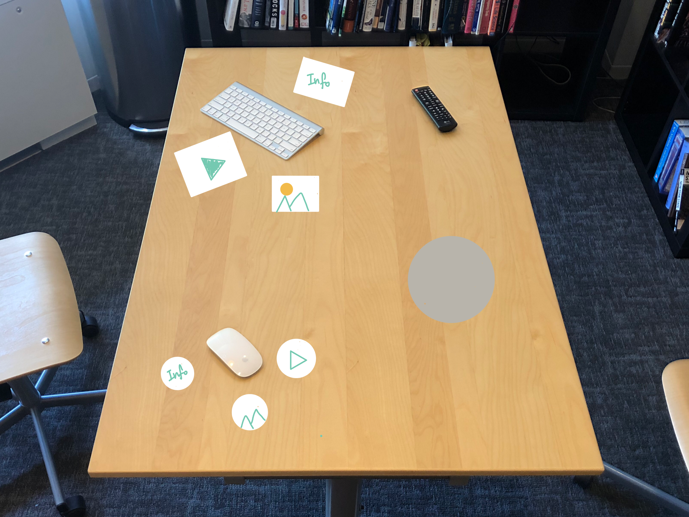
After setting the persona, we chose to work on the wireframing. For my job, I started with scoping out the space to display the exhibition. I determined we need to know it to design the experience accordingly. I took photos with my iPad of possible exhibition areas, draw low-fidelity sketches, and shared to teammates to receive feedback and decide the final location.
Setting Goals and Limitations
During the low-fidelity prototyping, I realized the augmented reality app should be treated differently compared to other mobile apps because customers are going to hold the tablet for a considerate amount of time which can make their hands and arms tiresome. Hence, I researched online on what to consider when designing for the augmented reality app, and I created the list our app should follow:
We have to find the space that has enough table space so customers can leave the tablet on it and have a break in between.
The length of digital content should be within two minutes. Because our primary persona was a high school student, I worried they might not be able to hold the tablet for so long as they watch digital content. Therefore, we chose to cut down each material to a maximum of 2 minutes.
The whole museum experience should end within 30 minutes. I didn't want customers to get tired of holding the tablet by the end of the exhibition.
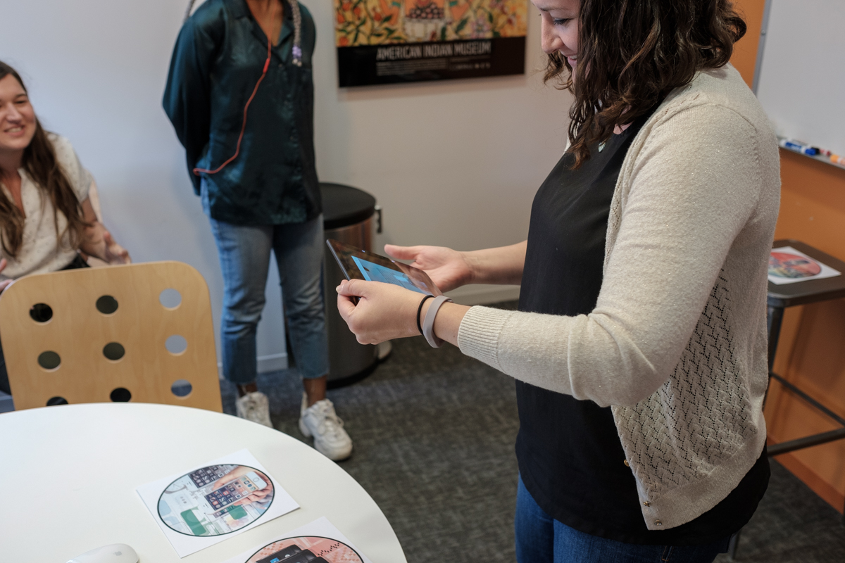
Our client testing out a prototype
Research
Despite a tight deadline, we conducted two usability testings to make certain features work correctly and hear feedback from coworkers. For each session, there were five participants to test the prototypes.
To conduct the testing, we rented a meeting room, set up anchors for the AR app using printed materials, and have participants do talk-a-loud method as they go through the app without any guidance. I did the quantitative research to make certain features work or not, and we also asked questions to gather detailed feedback.
Communication
There were design, production, and programming team with different background and being on the same page was critical. To communicate, I created visual prototypes. I also created documentation on UI and interaction flow.
One of prototypes I created to communicate with teammates
Overview of the AR app
UI flow
Hi-Fidelity Prototype
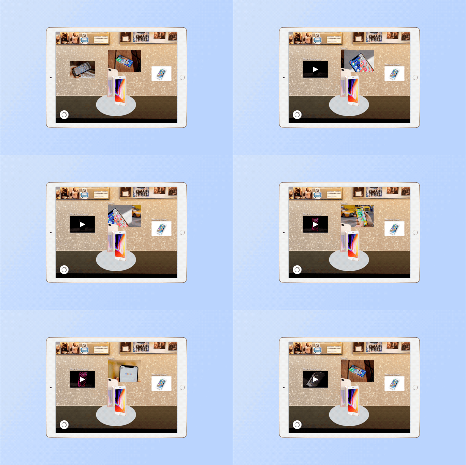
After a few iterations based on usability testing and client’s feedback, here are final designs.
Demonstration of the app
Reflecting on Findings
During one month of our intern project, I, most importantly, learned how to communicate with coworkers with different background. To overcome our differences, I created extensive design materials to communicate with them. In addition, I learned more about exhibition design and augmented reality design principles.


