An internal brand-management tool, designed and built through an AI workflow.
I took an engineer's Innovation-Week concept and reworked it into an enterprise-grade tool for the internal teams who keep 200+ brand pages accurate. Chat GPT Codex carried the exploration and the build; engineering got a working prototype and a Figma file instead of a static spec.
RoleDesigner · AI-augmented workflow
CompanyThe Home Depot
Timeline2026
SurfaceInternal B2B web tool
UsersInternal teams
StatusPrototype handed off · on the backlog
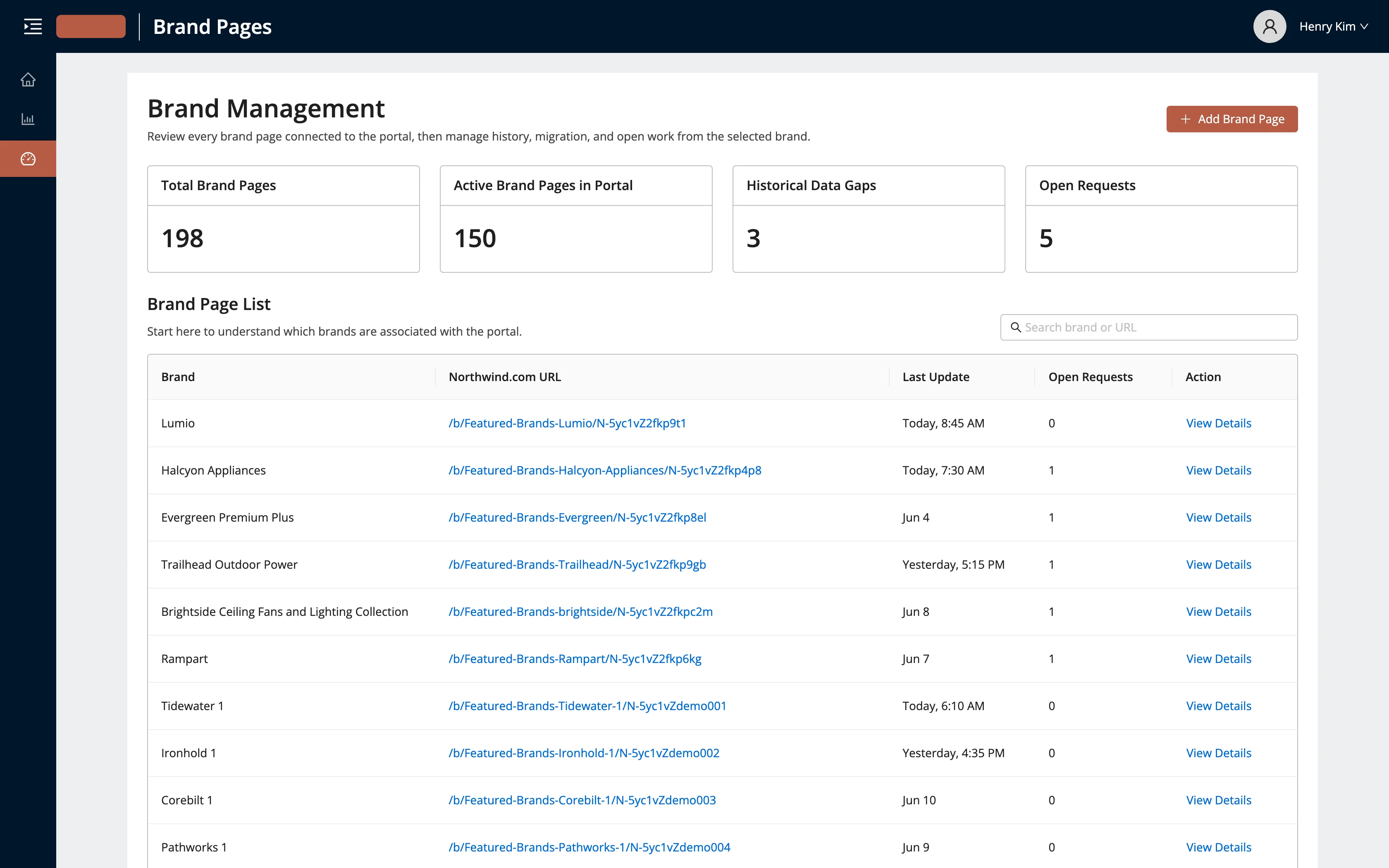
Fig. 01 — The internal console. Every brand page connected to the portal in one place, with data
coverage, migrations, and open requests on one screen.
01The seed
An engineer built the first version during an Innovation Week — a rough concept for managing
brand-page data from the inside, and a strong enough foundation to build real UX on. The team liked
it enough to want it for real. It didn't need a new idea so much as someone to make it
enterprise-grade and native to the brand-page tools these teams already used every day.
This one is internal-only. The supplier-facing portal lets brands build and publish their own pages;
this sits behind it, for the teams who keep every page's data connected and accurate. It shares the
design language and does a completely different job.
02What it solves
Three routine tasks, each one a chain of spreadsheets, emails, and one engineer doing it by hand.
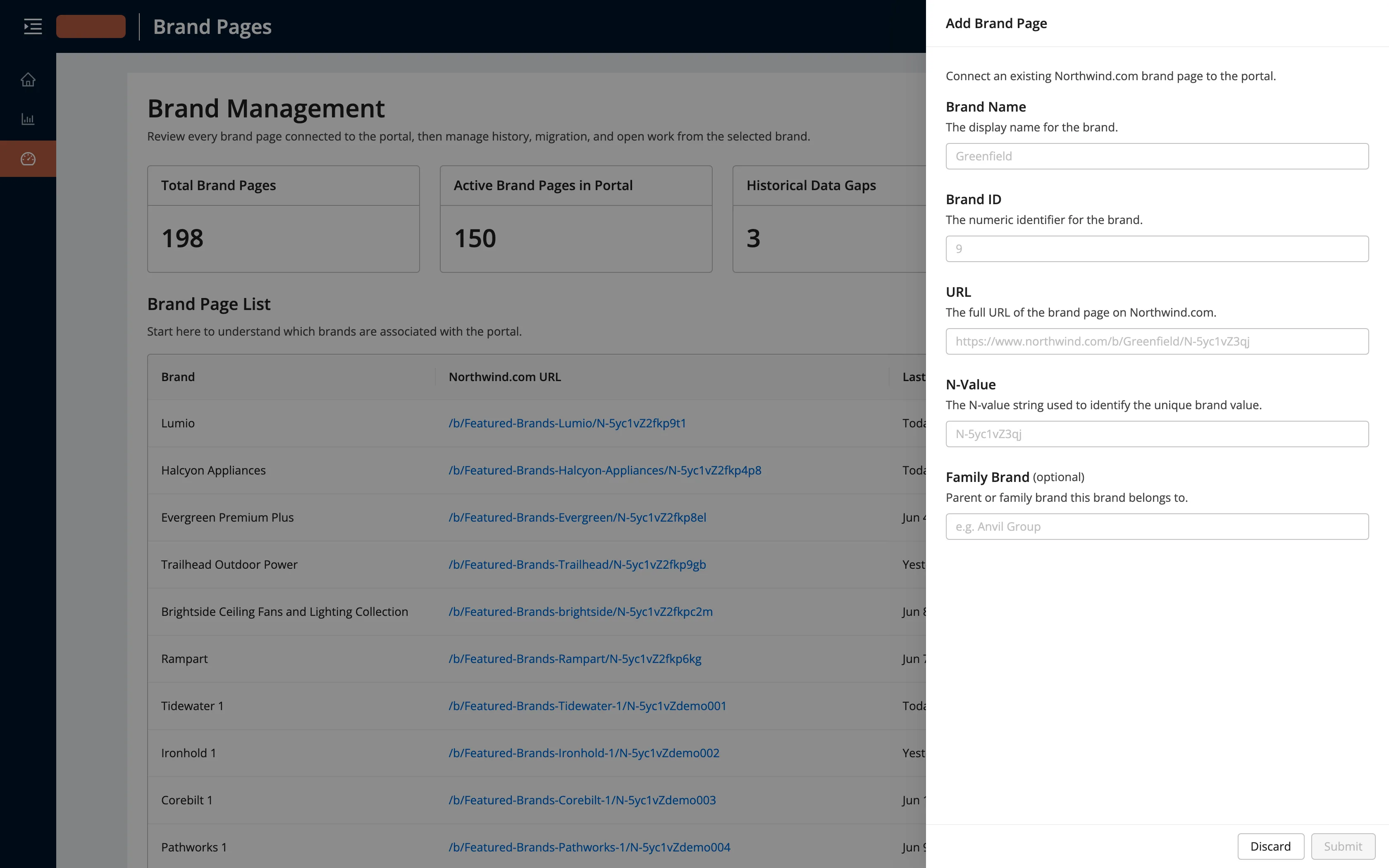
Connecting a brand page's data to the portal meant a salesperson filling out a spreadsheet, emailing
our team, and waiting for an engineer to key it in through a form. Slow, and it put an engineer on
clerical work for every legacy page. The tool turns that into one request the system fulfills on its
own.
Fig. 02 — Connecting a legacy page. The spreadsheet-and-email relay becomes a form the tool acts on directly.
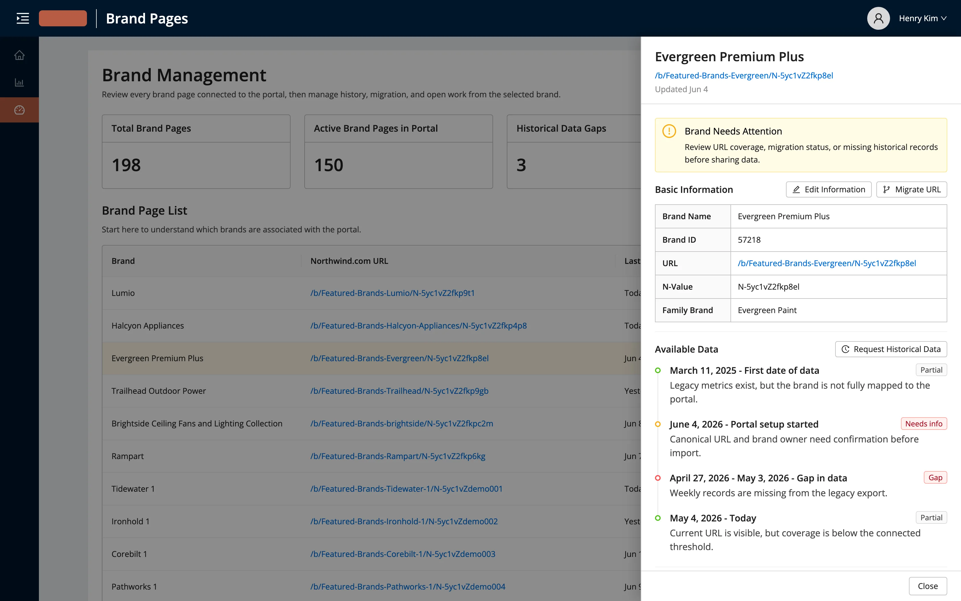
With more than two hundred pages, we couldn't pull every brand's metrics on demand. Data came in
batches and often arrived with holes — a missing week in one place, a range that predated what we'd
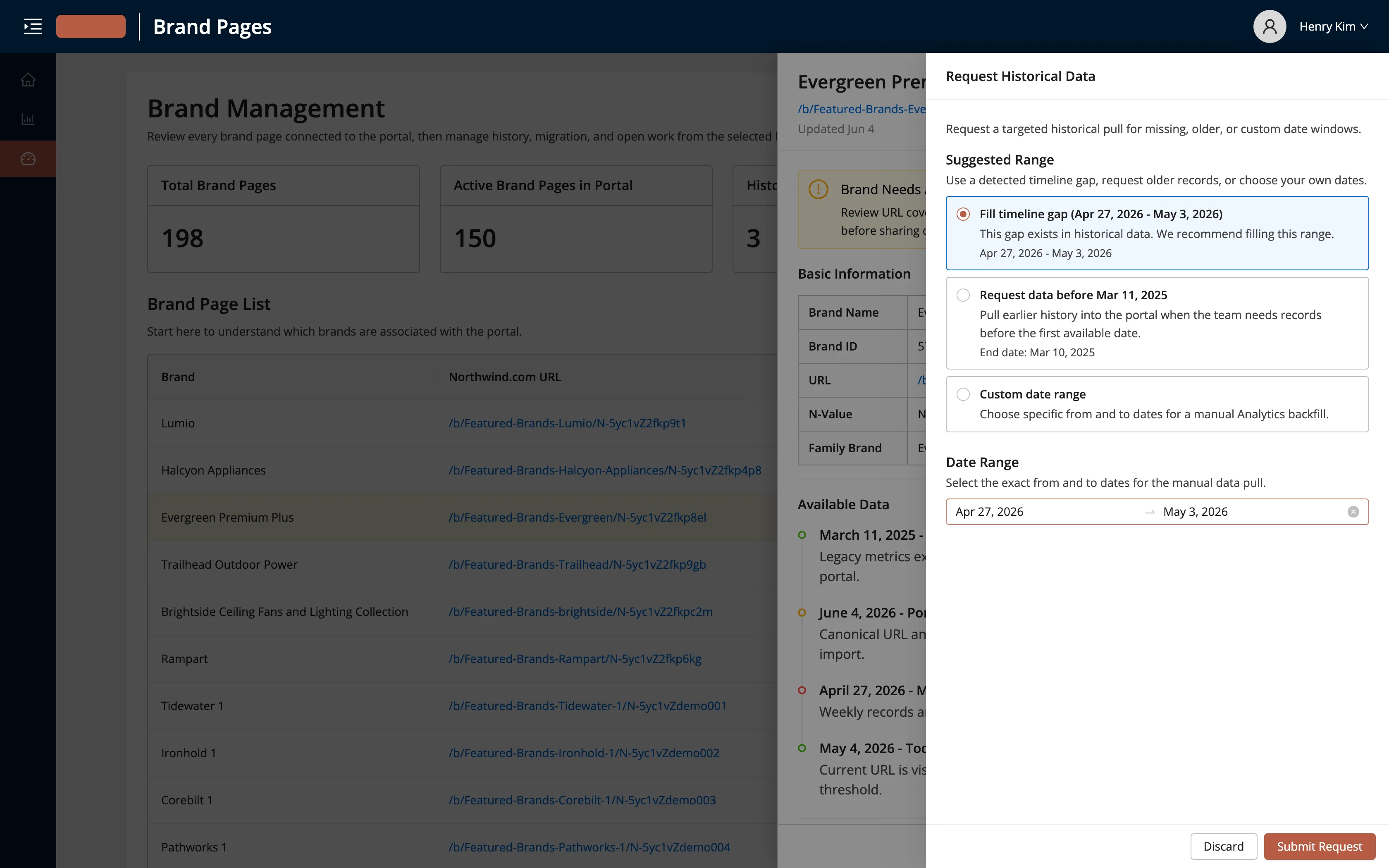
loaded in another. Every gap turned into its own round of questions between teams. The tool reads the
gap off the brand's timeline and lets someone request that exact range in one click.
Fig. 03 — A brand's data timeline. Coverage, migrations, and a flagged gap read straight off the record, so nobody has to hunt for what's missing.Fig. 04 — Requesting historical data. The detected gap is offered first, so filling it is a confirmation instead of an investigation.
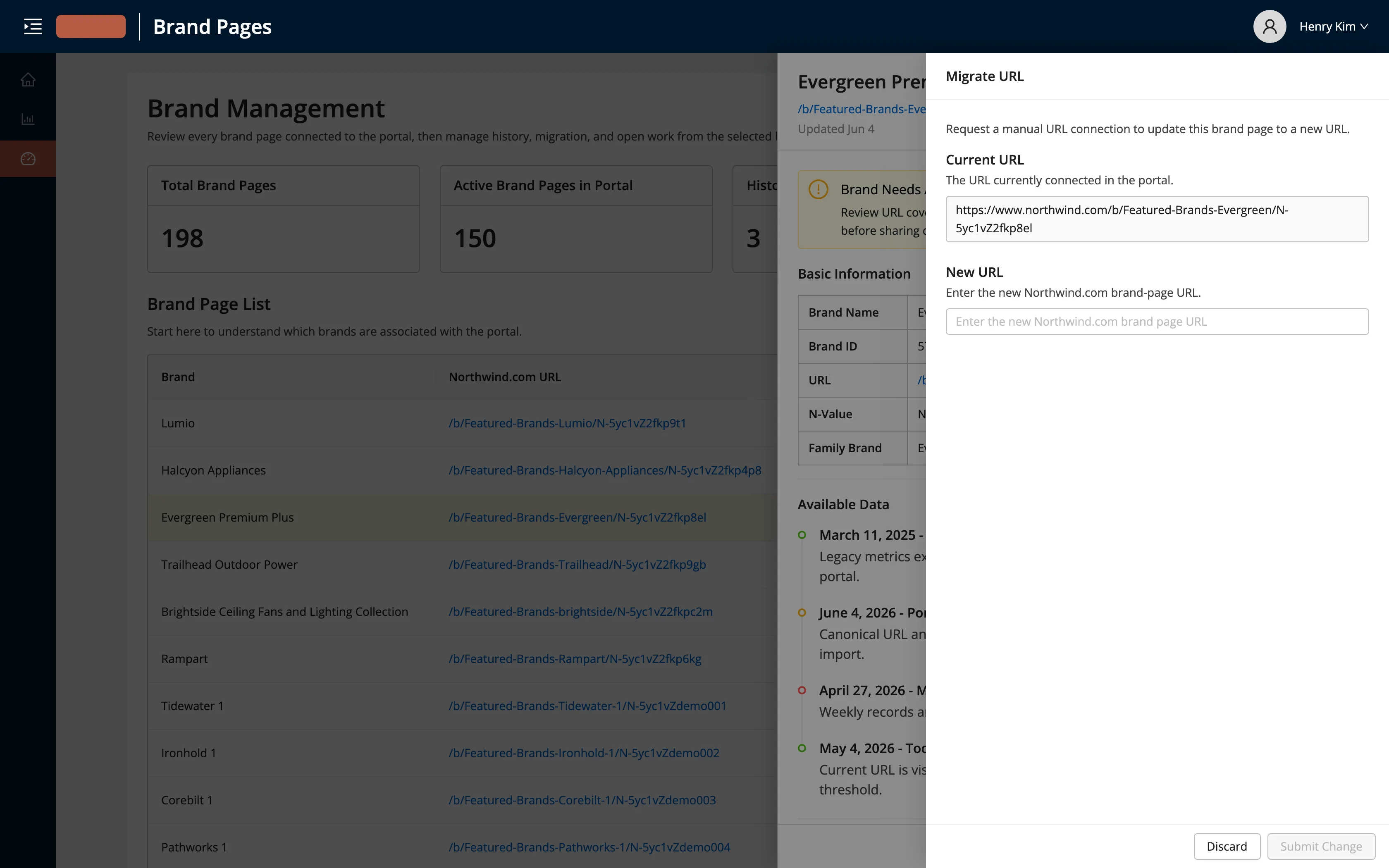
When the SEO team changed a page's URL to rank it better, everything tied to the old address had to
move with it by hand, without letting data quality slip. The tool migrates the URL, keeps the record
attached, and runs the same validation on the input.
Fig. 05 — A URL migration. The manual, fragile version becomes a guarded request that keeps the data attached.
All three are the same shape: a manual relay between teams that the tool now handles on its own.
03How I worked
I stayed on the design work, brainstorming and iterating, while Codex handled the rest of the exploration and generated the handoff files. It was my first real run at working this way, and it changed how I want to use AI as a designer.
I'd talk a goal through with Codex — how the data-gap flow should behave, or how a migration should
feel — then have it generate designs. Some pushed me into scenarios I hadn't considered. I made sure
it understood the validation and state patterns I'd used on other screens, and it produced the full
set our engineers would need to build against.
I didn't spend days translating a finished design into a build. The prototype
was the design: real states, real validation, real interactions I could
click through and correct in place. The Figma handoff, which normally would have taken me a long time
to assemble by hand, I generated by pointing Codex at the work through the Figma MCP. That time went
into the design instead of the busywork around it.
The result was two artifacts: a working, interactive prototype engineering could run, and a
Figma file for formal handoff, both built from the same set of decisions.
04The design
The engineer's version worked, but it didn't feel like it belonged next to the rest of Brand Pages.
My job was to close that gap.
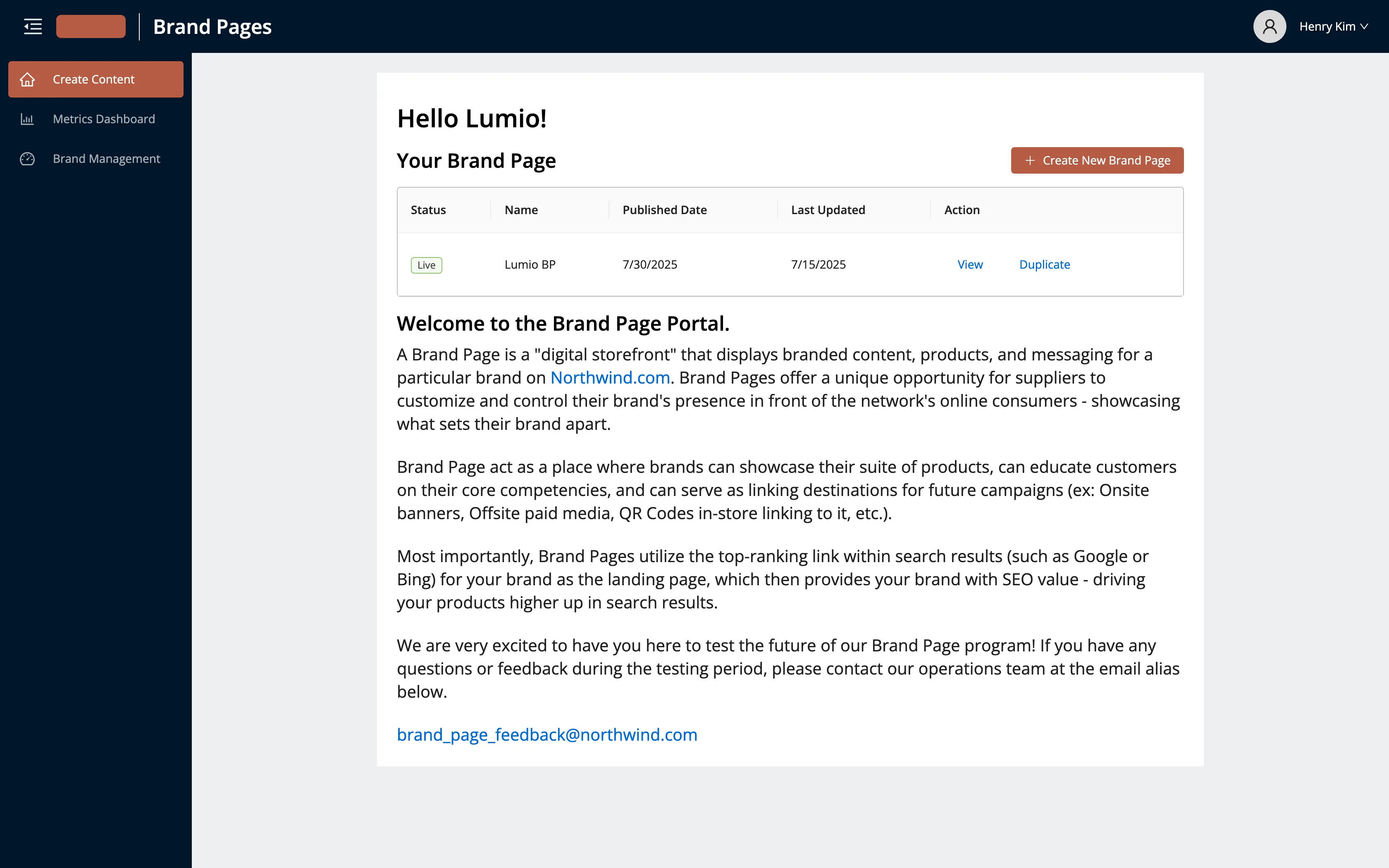
I rebuilt the navigation, layout, and visual language to match the existing brand-page tools — same
header, same table and drawer patterns, same spacing. An internal user shouldn't be able to tell
where the brand-page builder ends and this tool starts.
Fig. 06 — The supplier-facing brand-page builder. I designed the management tool to sit inside this system, not beside it.
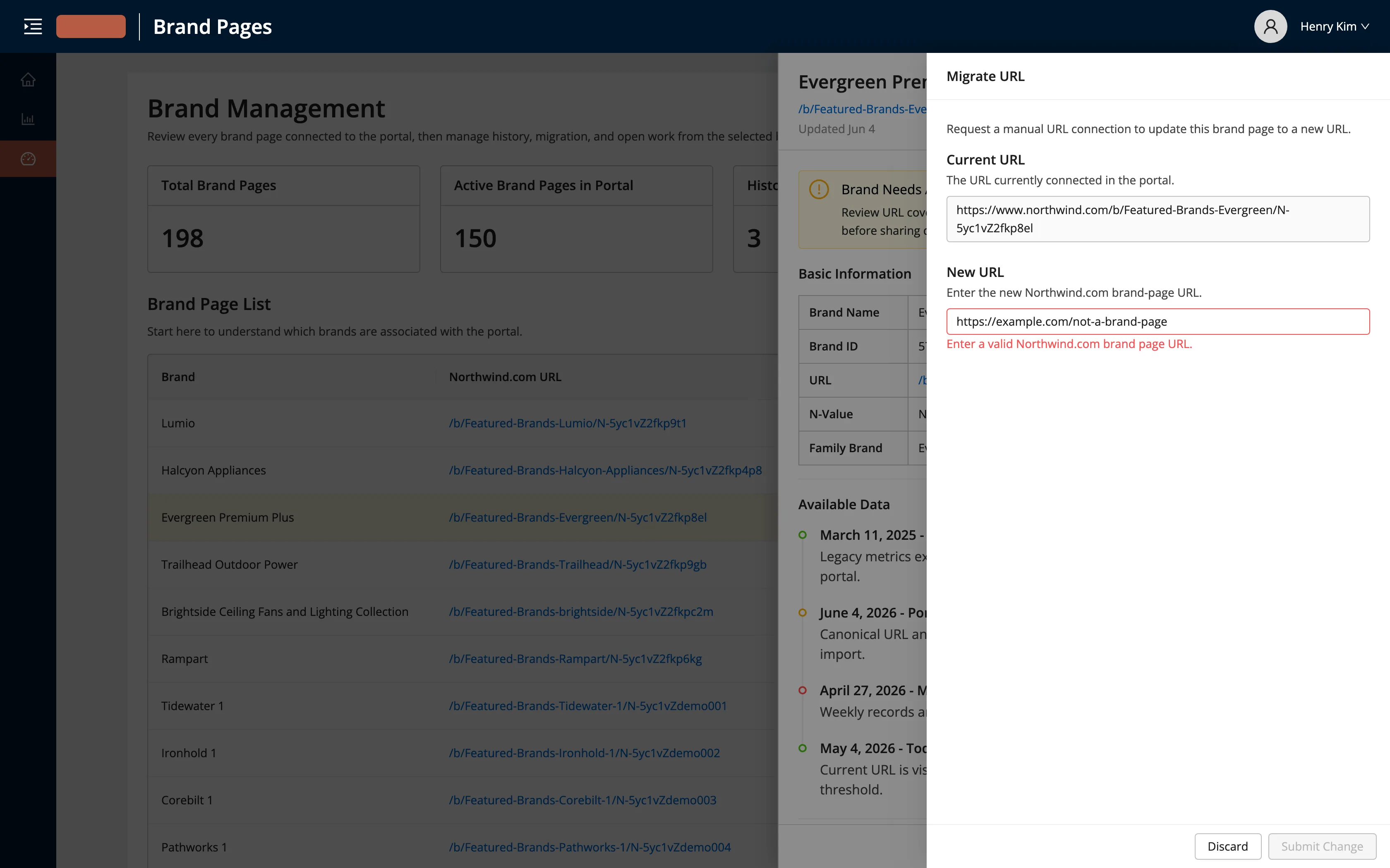
The bigger effort went into the states a mockup usually skips: validation and error messages, empty
states, hover and tooltip behavior, what a field looks like when it's wrong. I built all of it into
the prototype. That's why handing engineering working code mattered — the intent is in the
interaction, not buried in a spec doc.
Fig. 07 — A state most mockups skip. The prototype carries the validation, the error copy, and the disabled action, so engineering isn't guessing at intent.
05Outcome
It left my hands as two things: a prototype that runs, and design intent you can read in the code.
I handed engineering the working prototype and the Figma file. The team's immediate roadmap was the
supplier-facing beta, so this one sits on the internal backlog until there's capacity. I'd rather be
straight about that: it's a complete design and a runnable prototype, not a shipped product with a
number attached.
What I take from it is a way of working I want more of. AI didn't design the tool — I did, in every
decision that mattered. What it did was collapse the distance between making a decision and having
something real enough to test, and let me hand off intent as working software instead of a document
someone has to interpret. That's the part I'm carrying forward.